Burlington Mobile Checkout
Background
Burlington, a leading off-price retailer in the United States, was experiencing a high bounce rate on its mobile checkout page. The checkout process was complex, time-consuming, and confusing, which resulted in users abandoning their carts before completing their purchases. The company realized that they needed to improve the mobile checkout experience to increase conversion and decrease the bounce rate.
Goal:
The primary goal of this project was to make the mobile checkout process easier and faster for users, resulting in increased conversion rates and a decrease in the bounce rate.
My role:
Research, UX/UI design
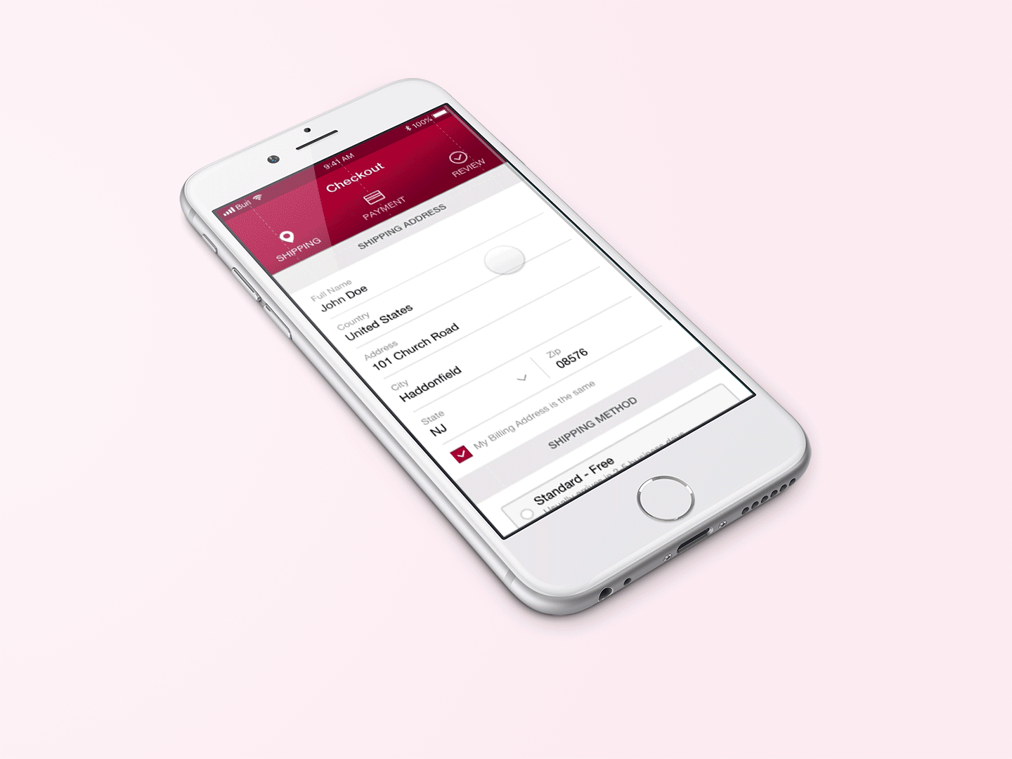
ORIGINAL CHECKOUT:

Research:
To understand the pain points and challenges users were facing during the checkout process, I conducted user testing. I also conducted competitive patterning to identify best practices in mobile checkout design. Finally, a collaborative sketch session was conducted to ideate solutions and generate ideas.
CHECKOUT FLOW:

WIREFRAMES:

FINISHED DESIGN:


Testing
To validate the design changes and their impact, we conducted an A/B split test. The test was conducted on two different groups of users, where one group was shown the new checkout design while the other group was shown the old checkout design.
A/B TEST RESULTS:

Results
The results of the A/B split testing were extremely positive. The new checkout design resulted in an 8.4% increase in conversion rates, indicating that more users completed their purchases. Additionally, the new design resulted in a 13.7% reduction in bounce rate, indicating that fewer users abandoned their carts before completing their purchases.