
Mobile Header Redesign for Burlington.com
Goal
Burlington.com is an online retailer that offers a wide range of products from clothing and shoes to home decor and baby gear. The company was looking to redesign its mobile header to increase engagement and improve the ease of use for its users. The goal was to make the search more visible.
Research
The redesign process began with user testing to gain insight into the pain points and needs of users. A/B split testing and usability testing were conducted to test different versions of the header and gather feedback from users.
Findings
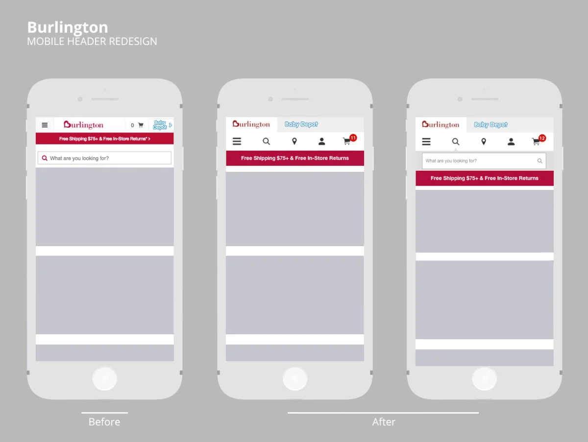
The biggest learning from user testing was that when users were trying to access their cart, they were mistakenly taken to the Baby Depot landing page. This helped the team discover why the Baby Depot homepage had a significant bounce rate, as well.

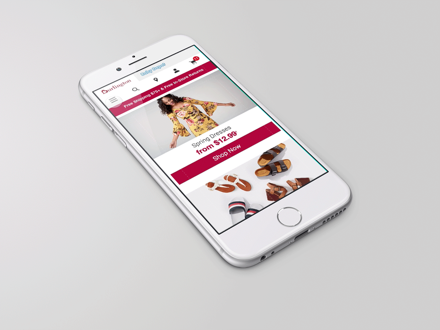
Based on these findings, the team made some key changes to the mobile header. The search bar was made more prominent, and the cart icon was moved to a more accessible location to avoid confusion with the Baby Depot landing page.
Results
After the mobile header redesign was implemented, the bounce rate for Baby Depot's landing page was reduced. Additionally, users found the website easier to navigate and engage with, leading to increased engagement.